Making One Room Flow Into the Next: Colour From Room to Room
A home with a good colour flow feels calm because your eye never has to stop and reset at a doorway.
October 28, 2026 · 4 min read
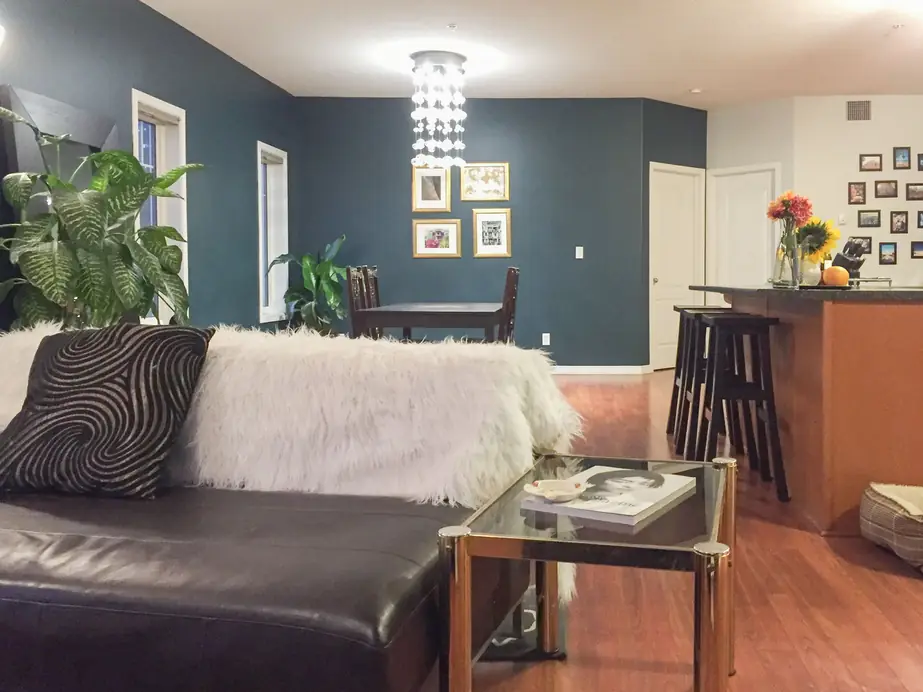
You can choose a lovely colour for every room in the house and still end up with a home that feels disjointed. The living room is warm and cheerful, the hallway is cool and grey, the dining room is a deep green you saw in a magazine, and standing at the front door looking through all three, nothing quite agrees with anything else.
Flow is the quality that fixes this. It does not mean painting every room the same colour. It means choosing colours that relate to each other so the house reads as one place. Here is how to think about it, along the lines of how Amanda Funk, owner of The Painter Lady, approaches a whole-home palette.
Look at your sightlines first
Before you think about individual rooms, stand in the spots where you can see more than one at once. The front hall looking into the living room. The kitchen looking across to the dining area. The top of the stairs with three doors in view. Anywhere two colours meet in the same glance, they have to get along.
Open-plan homes make this obvious, since there may be no wall at all between the zones. But even in a house with traditional rooms, doorways and hallways create these overlaps. Mark them on a rough sketch. These are the places where a colour decision has the most effect.
Share an undertone, not necessarily a colour
The easiest way to make rooms flow is to keep the same undertone running through them. If your main living space leans warm, with cream, soft gold or earthy tones, the adjoining rooms feel natural when they lean warm as well, even if one is green and another is a muted pink. A cool grey dropped in the middle of a warm house stands out immediately, however good the grey is on its own.
Pick your overall temperature first, warm, cool or somewhere in between, and then choose your room colours from within it. That one decision removes most of the clashes before they happen.
Vary the depth, keep the family
Colours in the same family at different strengths are the classic way to link rooms. A pale version in the hallway, a mid-tone in the living room and a deeper one in a den can all feel connected, because they are plainly relatives. Variety comes from depth, and cohesion comes from the shared hue.
You can also use a quiet neutral as the connector. A consistent, calm colour in halls and transitions gives the more characterful rooms something to rest against. Bold colours then feel like intentional moments rather than random choices.
Do not forget trim, ceilings and doors
Trim colour is one of the strongest unifying tools you have. When the baseboards, door casings and window frames are the same colour throughout, they act as a thread the eye follows from one room to the next, no matter what is on the walls. Switching trim colours from room to room is how a house starts to feel patchy.
Ceilings work the same way. A consistent ceiling colour keeps the rooms feeling connected overhead, and it gives you the freedom to be more adventurous on the walls below.
Where colours should change
Walls should change colour at a natural break, such as an inside corner or a doorway, not in the middle of a flat wall. A clear line, such as the corner where a hall meets a room, looks deliberate. A colour that stops halfway across a wall looks like a mistake. In open spaces, a change at an inside corner, a fireplace surround or a built-in gives you a neat stopping point.
A simple way to test your plan
- Make a swatch for each room and lay them side by side on a table.
- Take the stack to your sightline spots and hold them up in the actual light.
- Check how each colour looks next to your flooring, since floors usually run through the whole house.
- Step back and ask whether the rooms look like they belong to the same home.
You do not have to do it alone
Planning a palette for an entire house can be the most daunting part of a repaint. The Painter Lady's colour consultants can recommend suitable colours for every room, aiming for a harmonious flow that suits you, your family and your guests. Amanda starts by visiting the home, then works your vision into a palette that takes your fixed elements and belongings into account. Consultations are free when you use The Painter Lady for your painting, and estimates are always free.
To talk through your own rooms, call (587) 989-2250.
The Painter Lady, (587) 989-2250
Call (587) 989-2250More articles
How to Choose a Wall Colour That Works With What You Already Own
A swatch only shows you a colour on its own, and your living room is never on its own.
What Happens to Your Walls Before the Paint Goes On
The finish you see depends on the work you never will, and most of that work happens before the lid comes off the can.